Introduction
Sprint.ly’s dashboard is the main entry point to the product. It consists of three main features: a Kanban board, a cadence graph, and a focus graph. These three features give everyone a 5,000 foot view of where the product sits.
The Kanban Board
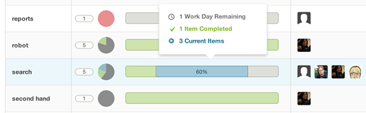
The Kanban board is comprised of four columns for each phase of a ticket’s life: Backlog, In-Progress, Complete, and Accepted. Items move left to right through the board as they progress through their lifecycle.
Item cards on the Kanban board can be prioritized by dragging them up or down within a single column or they can be moved left/right to push a ticket backwards or forward in the lifecycle.
You’ll notice that the Accepted column is always empty. Once and item is done it disappears from the board entirely. You can always get back to a complete list of your accepted items by clicking on the link in the middle of the Accepted column’s drop area.
The Focus Graph
Above the Kanban board are two sets of graphs. The pie charts to the left are what we call the focus graph. There is a pie chart for each of the four phases of a ticket’s life: Backlog, In-Progress, Complete, and Accepted. Above each pie chart is a total number of items in each phase.
Each pie chart is broken down into four slices by item type. The In-Progress and Complete charts of are particular importance as they show what type of work your teams are currently focused on. For instance, if the CEO says that quality should be the main focus for the time being, you’d expect there to be more red than green in the In-Progress and Complete pie charts while the team flushes bugs from the queue.
The Cadence Graph
To the right of the focus graph, also above the Kanban board, is a stacked bar graph, which we call the cadence graph. This is a running window into how many items your team has marked as Complete in the last week.
The bar graph is stacked by item type so you can get a feel of where your team was focused on any given day. More red means they were focused on bugs that day, while more green would indicate they were focused on adding features.
Conclusion
The Sprint.ly dashboard is your window into the general focus and cadence of your product. We designed it specifically for non-technical people to use in the hopes that we can demystify what the technical team is doing and how progress is going.
We hope you enjoy it and, as always, welcome feedback!