Today we are excited to have guest author Andrew Liebchen for the Sprint.ly blog. Andrew has built Grandstand, a dynamic way to visualize your Sprint.ly data using our API.
Andrew Liebchen on Grandstand-Sprint.ly Integration:
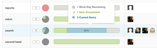
I keep three tabs permanently open in my browser: a live preview of my current project, Github, and Sprint.ly. It’s an integral part of the workflow at Financial Diligence Networks (FDN), from the scale of the team down to the team member. I spend most of my time flipping between Sprint.ly’s Dashboard, where I grab new items to work on from the Backlog, and the Activity Feed, which helps me keep track of what everyone’s doing in real time. It’s really easy to keep the focus on the current sprint.
There are times, like during our weekly retrospective, when we want to zoom out and see the “20,000 foot” view of the entire project queue. I’ve always been interested in user interfaces driven by data visualization (I drew them almost exclusively in my last job), so taking a crack at our Sprint.ly queue seemed like a good challenge.
Each item in Sprint.ly has a few dimensions of data associated with it such as item type, scale, assigned user, status, and tags. Of all these, scale is the one that jumps out as being a literal dimension…each task is sized small, medium, large, or extra large, after all. Why not size items in the queue by score to get a sense of the massing of the work to be done?
A treemap is a go-to choice to fit a lot of things of various sizes into a given area. The biggest problem with a treemap is that the sizing of the items is relative: item size changes based on how many items you want to cram into given area. This isn’t so bad when you’re looking at something like the Federal Government’s budget where there is a lot of variation in size of the items. But in the case of the queue, there are only four (or five, if you count items without a score) different sizes possible, so it’s better to lock in the dimension of the item. That way, a large story is LARGE-sized regardless if there are five or five hundred items in the queue.
All we need is something to pack the items onto the screen to most effectively use the space. Metafizzy‘s Isotope plugin provides the perfect solution. It has the option for a masonry layout, an algorithm that optimally packs elements based on the available horizontal and vertical space “sort of like a mason fitting stones in the wall.” Since our items are sized on a 100px grid — small is 100px, medium is 200px, and so forth — they pack together nicely. The result is a lot like a treemap, except that item sizes are preserved.

Starting from some open source PHP and JS to parse Sprint.ly’s API, I built up a simple stylesheet with the help of SASS and Bourbon to mimic (but simplify) Sprint.ly’s look and feel. I hooked up the items to Isotope, which fires after the items have been pulled from the API and constructs the masonry layout. A series of drop downs in the header allow you to filter the items by important parameters; for instance, you could set the filters to see only the stories assigned to you that are in the backlog. The filtering functionality is built into Isotope, and is made smoother by CSS3 transitions.
With some help from Josh Jordan a developer at FDN, we reviewed and cleaned up the code a bit, named it Grandstand, wrote some documentation, and pushed the repository up to Github. Give Grandstand a try, or even better, fork and improve. There’s plenty to do, including sorting, filtering by multiple parameters, and pulling in more item data.
Thank you Andrew for sharing this awesome integration! You can find out more about Grandstand on Andrew’s GitHub page: https://github.com/andrewliebchen/Grandstand.
We encourage Sprinters to take full advantage of our API. If you have an integration you are working on please let us know!
We encourage Sprinters to take full advantage of our API. If you have an integration you are working on please let us know!
More info on Andrew can be found here:
Find us on Twitter: