When we introduced the new user interface direction at Sprintly, it’s fair to say it was exclusively focused at larger teams with more complicated project management needs. The flipside of this was that older customers who’d fallen in love with our older, simpler interface felt a bit overwhelmed.
Today I’m happy to announce we’re deploying an entirely redesigned set of navigation and filtering menus that we hope will keep our big teams happy while extending some much needed visual clarity to our smaller teams. Those changes include:
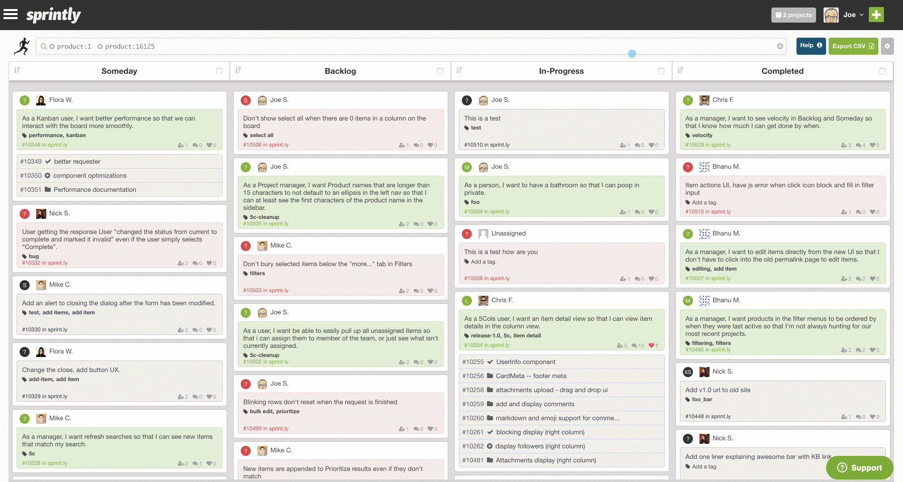
- A new project selection menu in the upper right of the screen. This works just like the old project filter menu with one noticeable upgrade: selections are remembered across sessions. You can now select the project or projects most important to you and ignore the rest.
- We’ve moved the navigation menu from tabs across the top into a new context, or “burger”, menu. In addition to this, we’ve disabled “single project views” until you set Sprintly to filter by a single project.
- The filters have been moved into the context menu. Sprintly allows you to filter your items on dozens of fields, many of which aren’t always needed. This helps reduce visual clutter while keeping that power one click away.
One last thing I’ll note is that when you select filters they’ll follow you as you click around the new views. I put together a short video that goes over each of these new menus:
Enjoy and let us know what you think on Twitter!